Landing Pages
A landing page is a standalone web page created to fulfill a single purpose; it should be simple in design and give visitors the targeted information they seek based on the promises conveyed in your outgoing marketing efforts. Just as a stream leads to the ocean, a well-crafted landing page is a crucial element to any marketing campaign or strategy, guiding visitors toward their desired destination.
Make a Splash with Your Landing Page
Dueling Fish Designs is a boutique marketing agency in Houston, Texas. Passionate about guiding small businesses and start-ups through the murky waters of strategic marketing, our team aligns your website and brand with tailored solutions that fit your business, budget, and growth plan.
Among the many tools in our tackle box that we rely on for generating leads, landing pages stand out as a cost-effective favorite. Let me tell you why…
Why Do You Need a Landing Page?
Your home page is NOT a landing page.
I said what I said.
Your home page acts as the introduction to your brand and shows visitors what content you have to offer. It should be teeming with Calls-to-Action, links to services and/or products, and imagery, enticing visitors to explore and find what they seek independently.
In contrast, Landing Pages cut out the middleman, bringing visitors directly to the page they desire. They offer fluidity of design and can be tailored for specific regions and demographics.

Types of Landing Pages
Just like the vast ocean, there are countless types of landing pages out there. And while this list may not cover them all, these are the ones we feel make the biggest splash!
Lead Generation Landing Pages
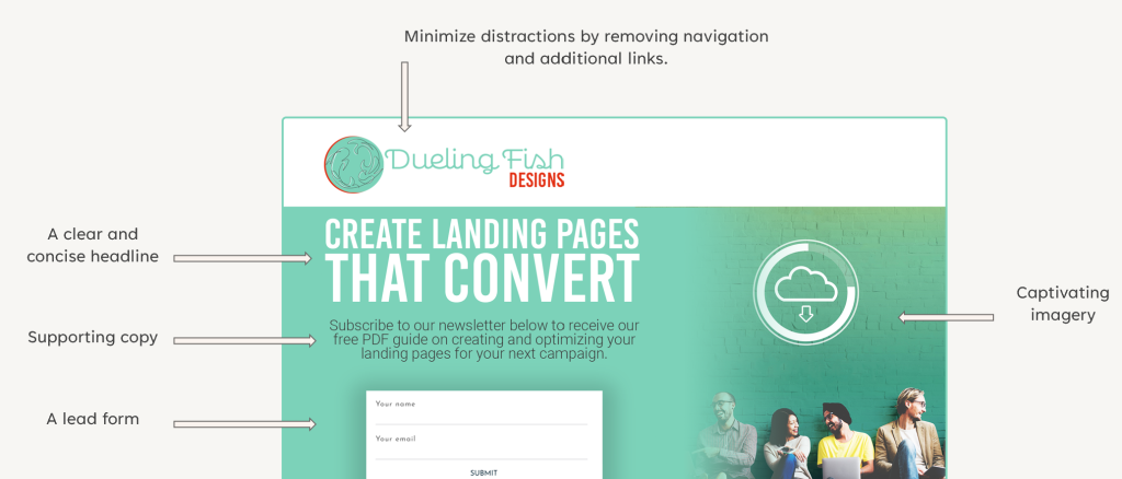
Lead generation landing pages are designed to catch visitor information (name, email address, phone number, etc.) in exchange for the bait – which is typically a free offer or resource. These pages will always feature a lead form, and a clear and compelling headline explaining the benefits of your offer.
The Goal: These are great for getting email newsletter sign-ups, distributing marketing materials, like ebooks or PDFs, registering users for events, or scheduling a sales call.
Click-Through Landing Pages
Click-through landing pages are bait designed to lure visitors to a specific page, and then diving deeper into your website to make a purchase or signing up for a free trial. With a compelling headline, persuasive copy, and a clear Call-to-Action, these pages are built to capture the a sale.
The Goal: Think of this as a warm-up page; you see a product on Instagram, you open the link, they tell you some great things about the product, and the call to action is “Get it Now.” Click that, and then there you are, in a shopping cart with your product ready to purchase.
Explainer Landing Pages
Explainer landing pages are a long-form type of page. Just like a deep dive, these pages immerse visitors in a sea of content, educating them on the benefits and features of a product or service. These are typically used in promoting educational, or more expensive, products or services.
The Goal: An example of this might be what visitors see when shopping for a boat online; consider the details that would need to be provided to someone in search of a Sea Ray SPX 230.
Product or Service Landing Page
A product or service landing page is a campaign-specific variation of your product of service page. It includes all of the necessary information to convince the visitor to purchase. It is pretty similar to a click-through landing page, or even your standard product or service detail page, but I bring it up for important reasons:
- Creating a landing page for a specific product – for every product you have available – is a scalable way to flesh out your website over time.
- The landing page version of your products/services will minimize distractions that are likely found on the standard version of the page.
Best Practices in Building a Landing Page
Because it bears repeating, landing pages are built with a single goal in mind, and though those goals may differ, the following rules remain the same.
K.I.S.S.
Keep it simple, sweethearts! You want your visitors to consume your information and take action. Don’t distract them with unnecessary copy, functionality, or designs.
Limit Navigation
The key is to focus your visitors’ attention on a single call-to-action by sending them directly to the information they need. No menus. No related products.
Know Your Value
Identify what your audience wants and needs, then provide it to them on your landing page. Use benefit-providing copywriting to communicate your value proposition.
Compelling Visuals
Use bold and captivating headlines and compelling visuals that grab the visitors’ attention. Your call-to-action should be prominent.
Drop Us a Line
If your website isn’t reeling in visitors and leads, then drop us a line below.
